
ALLOY
/ Brand Evolution · Visual Systems /


THE BACKGROUND
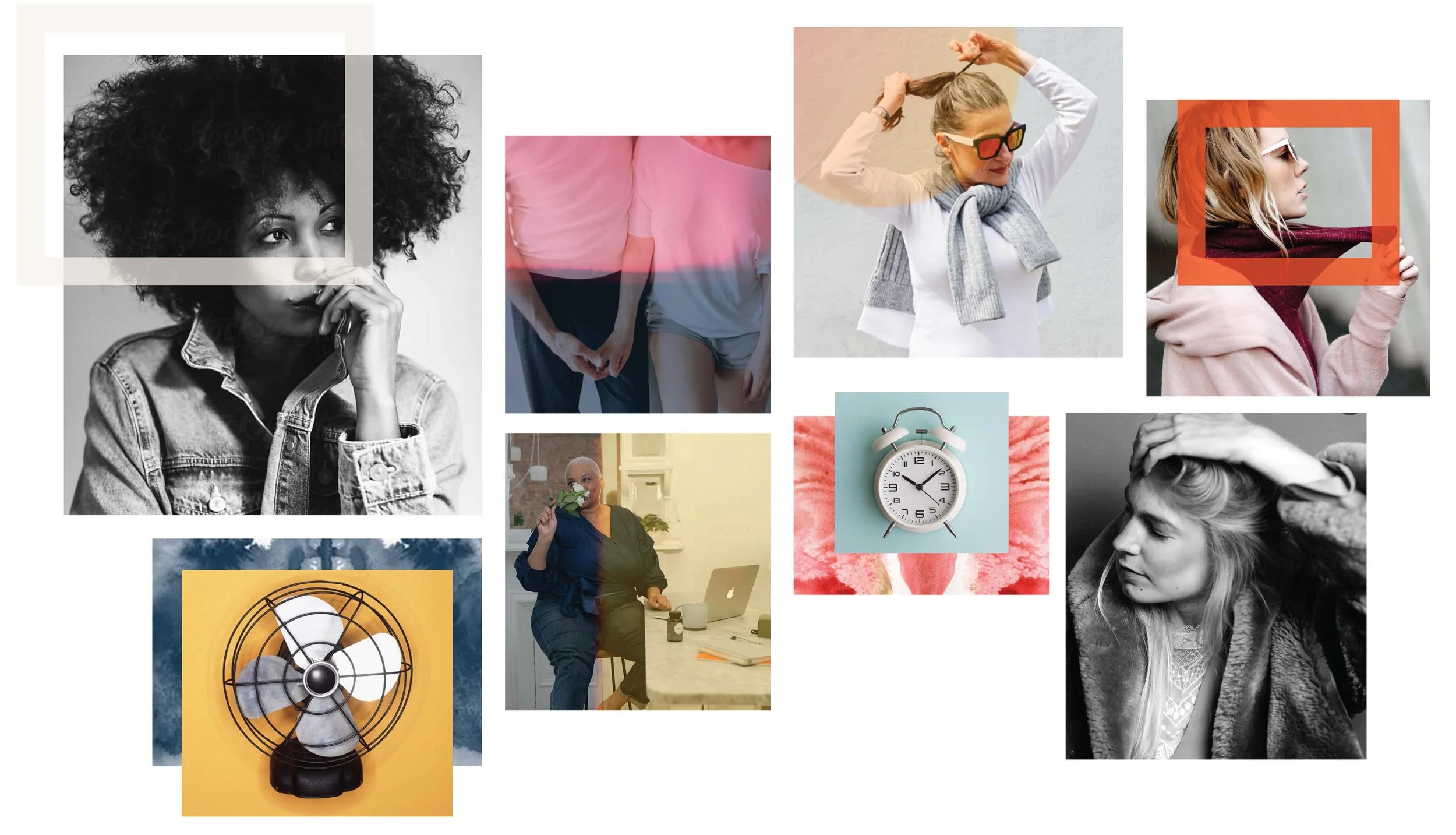
Alloy was building a modern, approachable women’s health brand focused on menopause and hormonal health an area of healthcare that had historically been difficult to navigate and rarely discussed openly. As the company expanded its digital presence, content and community, its visual identity was still taking shape.
THE CHALLENGE
Create greater consistency across Alloy’s evolving brand while developing a visual language flexible enough to support different types of communication, from health education and editorial content to marketing and acquisition without losing the brand’s distinctive personality.
THE SOLUTION
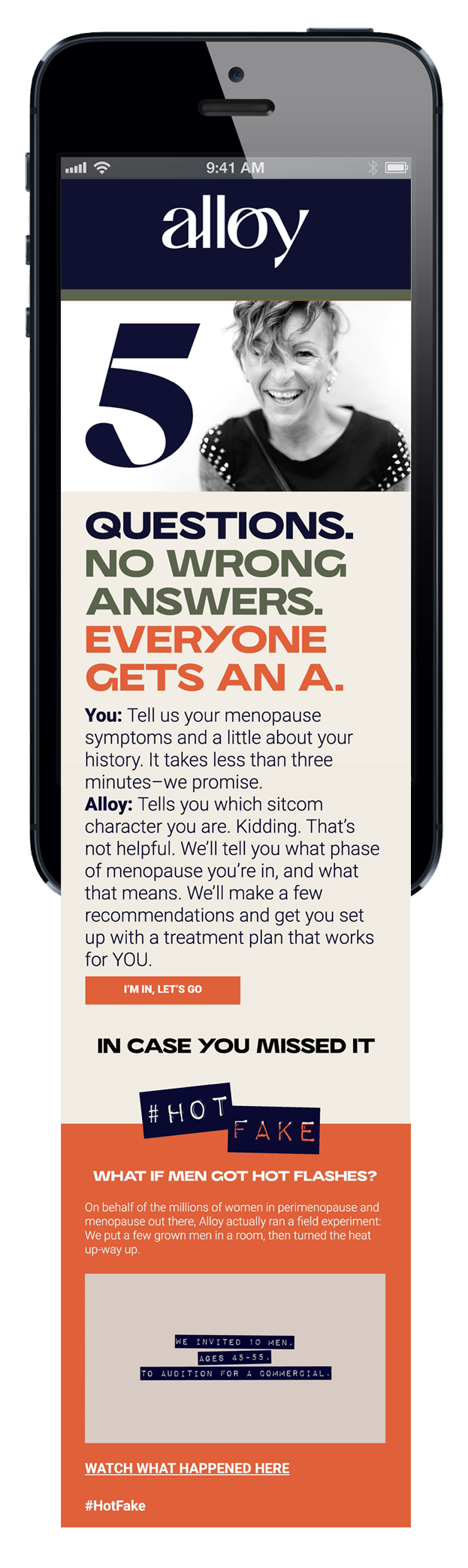
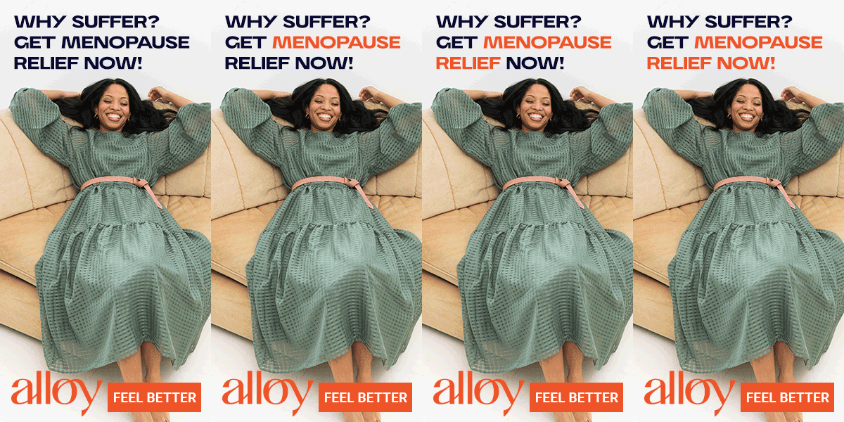
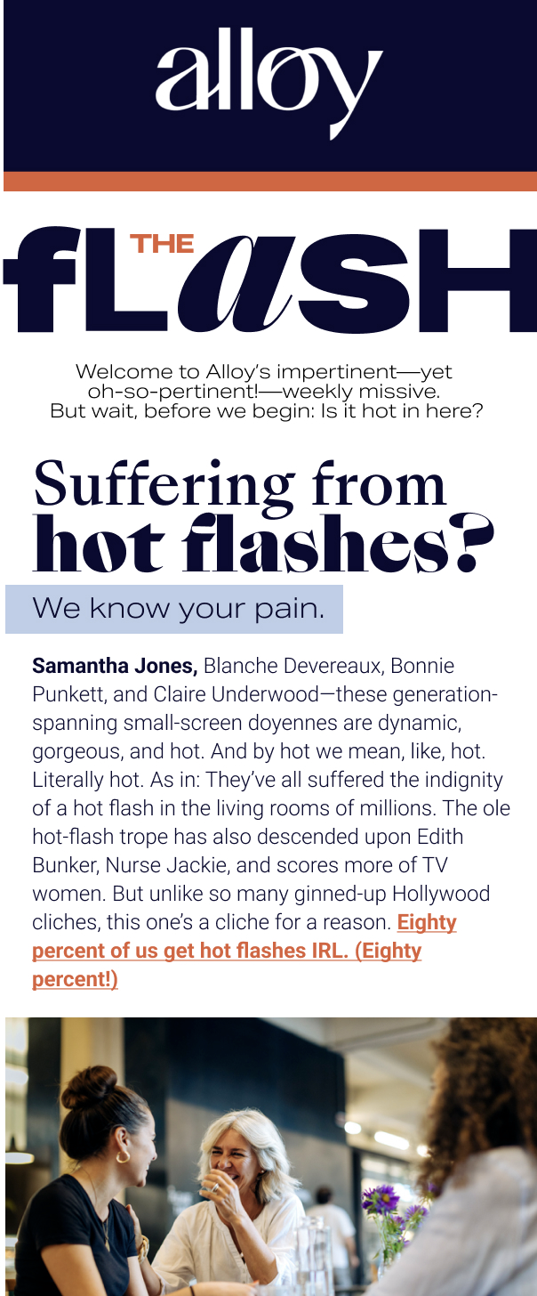
Working with Alloy’s Creative Director and marketing team, SmithCompanyDesign helped refine and operationalize the emerging visual identity through foundational guidelines, imagery direction and scalable design systems. Repeatable frameworks were developed across email, social and digital marketing, along with the logo for The Flash, Alloy’s editorial content platform, extending the brand into a distinct but connected content experience.
The result was a more cohesive and flexible brand expression that could adapt across channels as Alloy continued to grow.
VIOME
/ Campaign System · Cross-Channel Design /
THE BACKGROUND
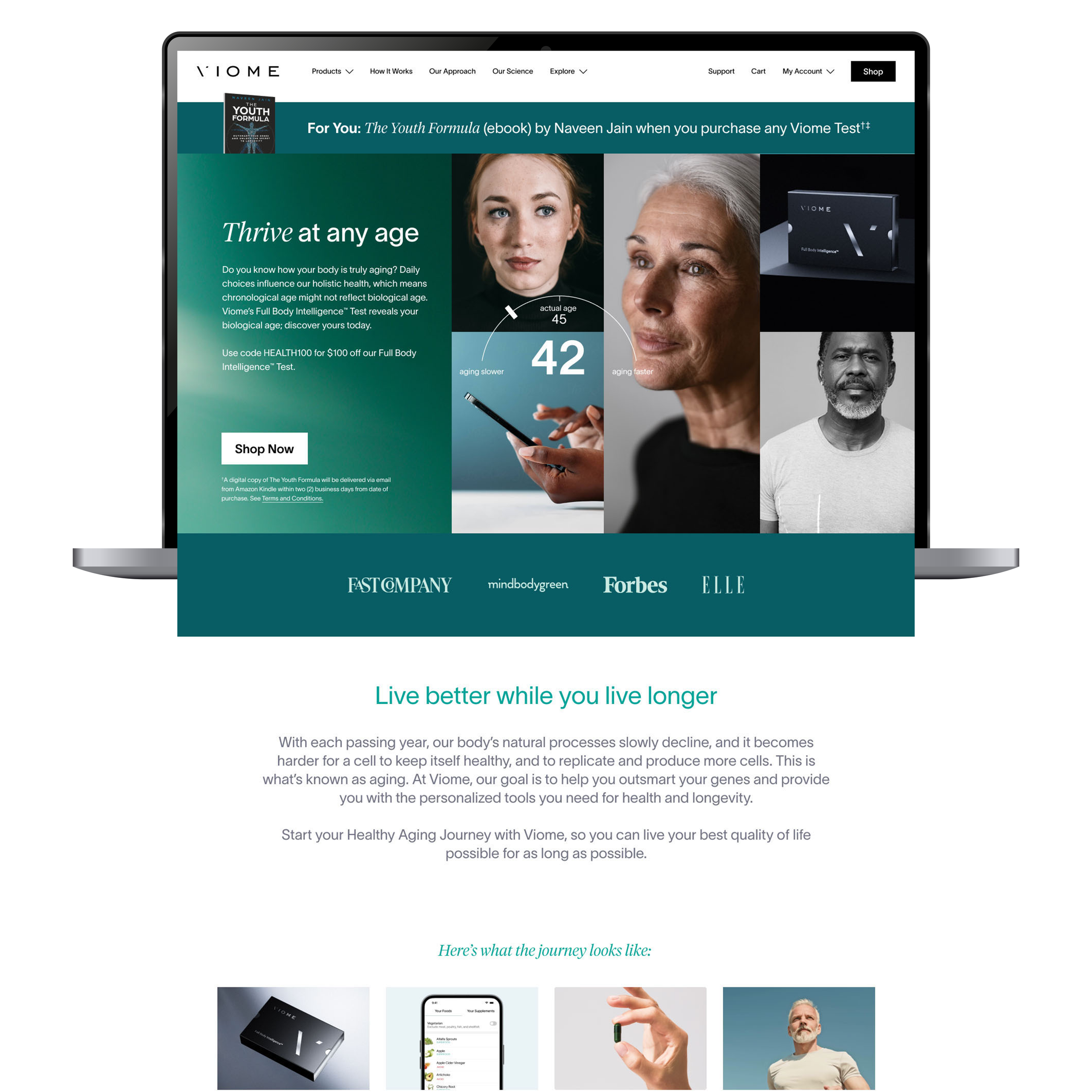
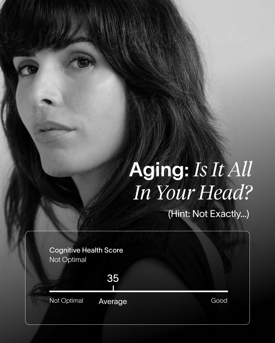
Viome uses at-home testing and AI-powered analysis to provide personalized health insights and recommendations. As the brand expanded its conversation around healthy aging and longevity, it needed a campaign that could bring those topics to life within Viome’s established brand framework.
THE CHALLENGE
Create a distinct visual expression for the healthy aging campaign while maintaining a clear connection to the Viome brand. The system needed to accommodate multiple health topics and messages while remaining cohesive across channels and formats.
THE SOLUTION
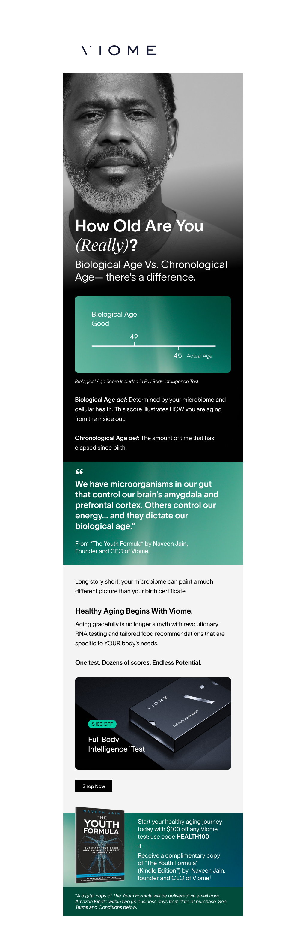
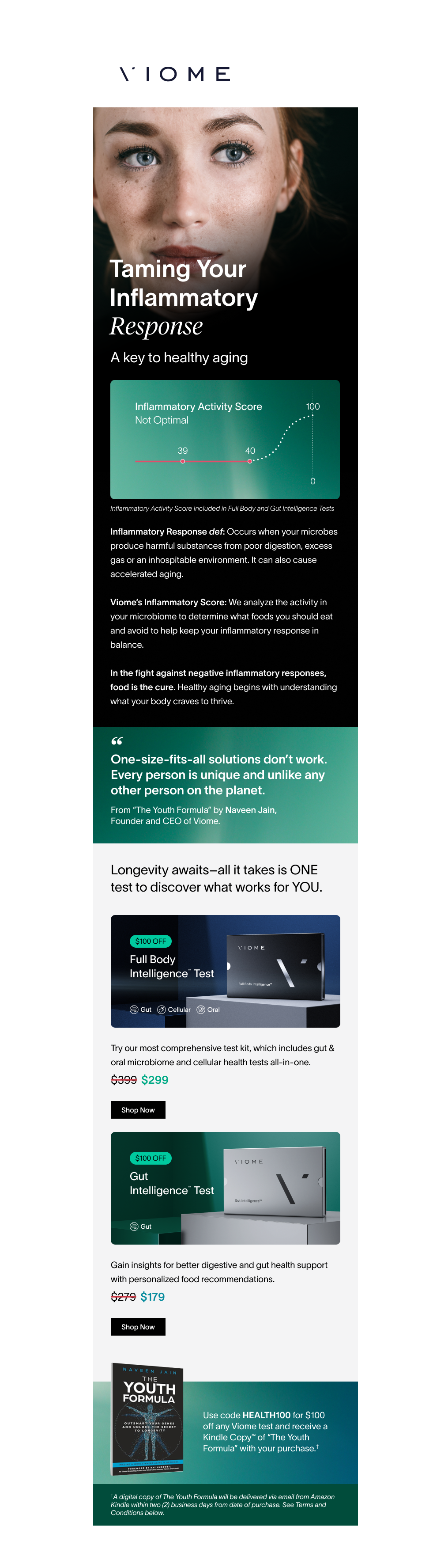
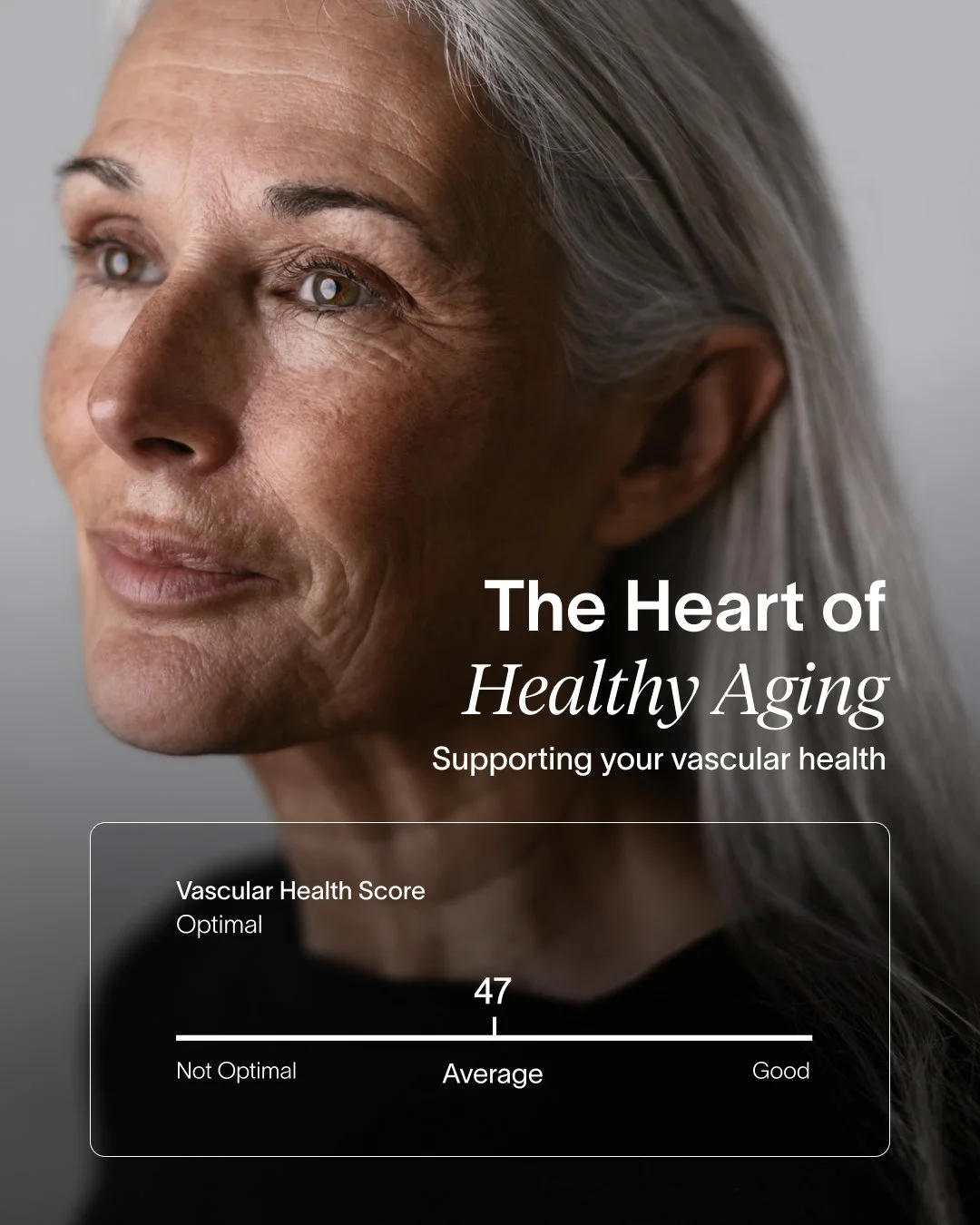
SmithCompanyDesign developed the campaign’s visual direction within Viome’s existing brand framework, establishing a photography approach and design system that paired expressive portraiture with bold typography and Viome’s biological-age data.
The creative direction was translated across web, email, social and paid media, with SmithCompanyDesign leading execution across channels. The result was a flexible system that allowed each message to feel distinct while remaining visually connected to the larger campaign
D’IYANU

/ Brand Evolution · Visual Identity /




THE BACKGROUND
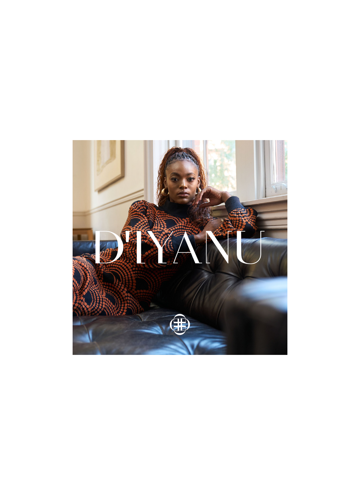
D’IYANU is a fashion brand known for bold, African-inspired prints and contemporary apparel. As the business grew and its presence expanded across digital, marketing and physical touchpoints, the brand needed a more cohesive visual identity to support its next stage of growth.
THE CHALLENGE
Evolve the existing identity without losing the energy and cultural expression that made D’IYANU distinctive. The refreshed system needed to bring greater consistency to the brand while providing enough flexibility to work across campaigns, digital experiences, advertising and other customer touchpoints.
THE SOLUTION
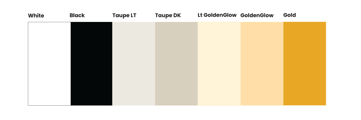
SmithCompanyDesign evolved D’IYANU’s visual identity by refining the color palette and developing a secondary mark, graphic patterns and a more defined approach to typography, imagery and brand expression.
These elements were brought together into a comprehensive brand guide designed to create greater consistency across channels while giving the brand room to evolve. The refreshed system was then applied across digital and real-world touchpoints, creating a more cohesive expression of D’IYANU without losing the personality at the heart of the brand.
Bed Bath & Beyond
/ Integrated Campaign · Omni-channel Design /

THE BACKGROUND
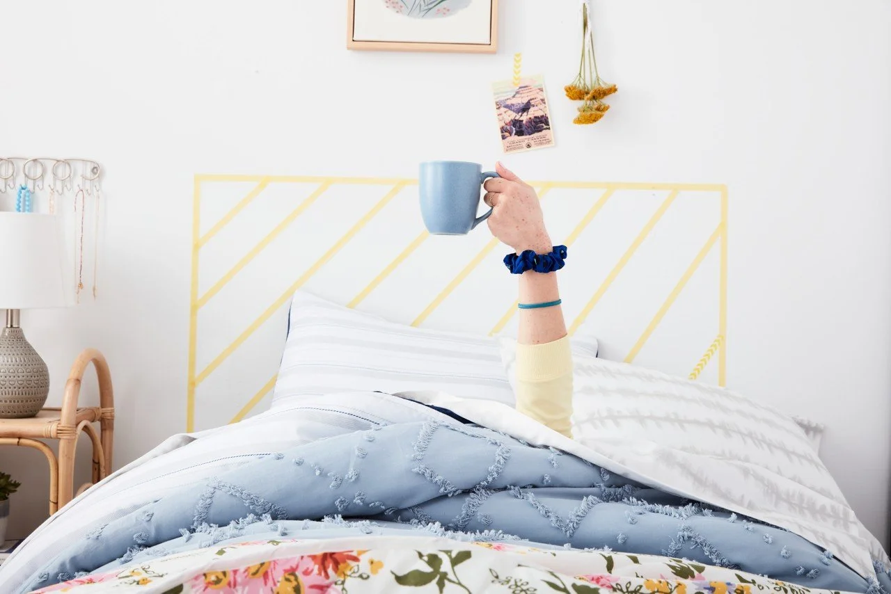
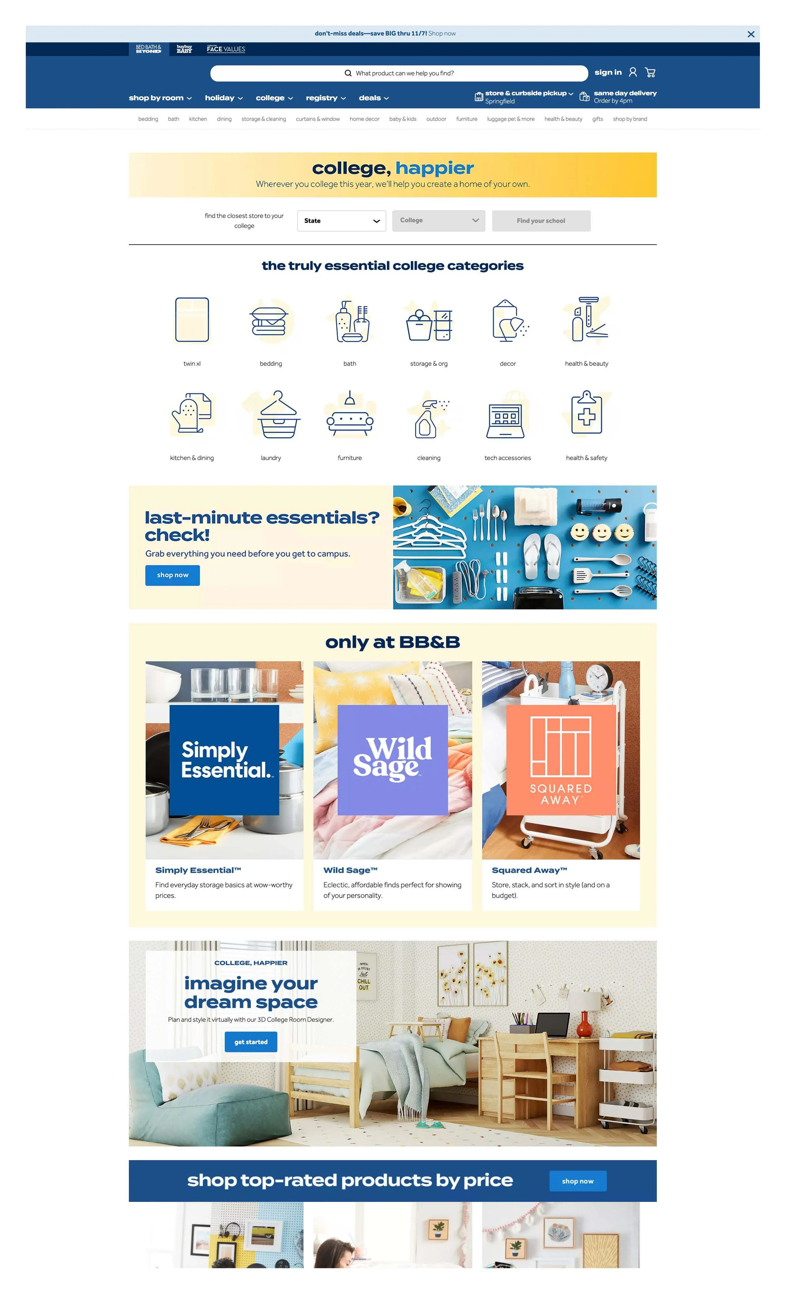
Bed Bath & Beyond’s back-to-college season brought together a wide range of products, services and promotional offers across both digital and physical retail. The “college, happier” campaign needed to create a recognizable seasonal experience wherever customers encountered the brand.
THE CHALLENGE
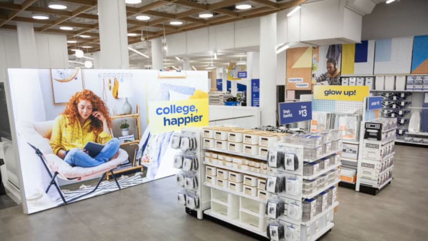
Translate the campaign across a broad mix of customer touchpoints while maintaining a consistent visual story. Ecommerce, digital marketing, promotional creative and in-store experiences each had different functional requirements, but needed to feel like parts of the same campaign.
THE SOLUTION
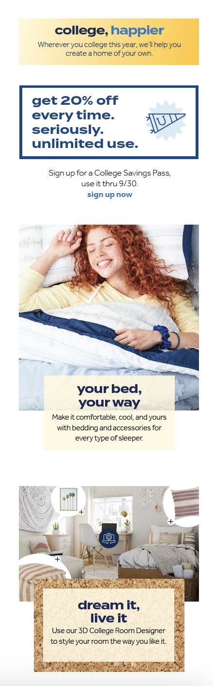
SmithCompanyDesign led the creative team responsible for translating the “college, happier” campaign across ecommerce, email, digital marketing and in-store experiences, establishing a consistent approach to photography, typography, promotional messaging and graphic elements.
The system accommodated everything from product discovery and promotional offers to the 3D College Room Designer while maintaining a cohesive visual experience across channels.

/ Campaign Identity · Creative Expression /
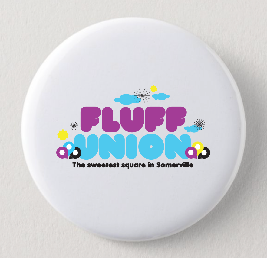
Fluff Union


THE BACKGROUND
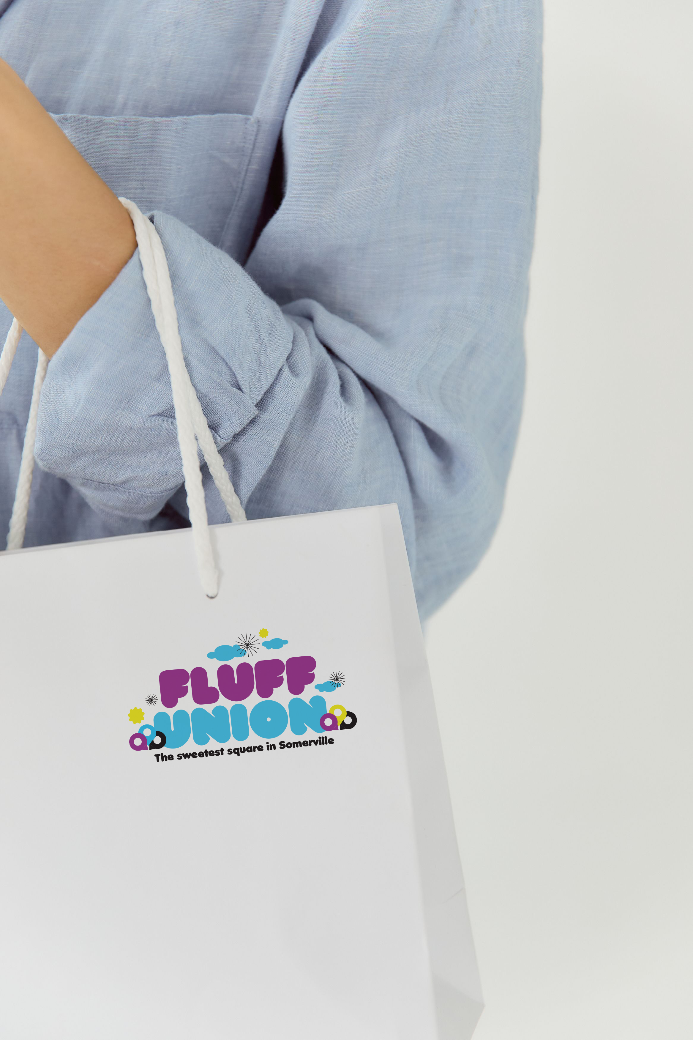
The 2023 “Fluff Union: The Sweetest Square in Somerville” festival celebrated Marshmallow Fluff’s local roots while highlighting Union Square as a vibrant cultural destination. The annual community event needed a visual identity that captured its playful spirit and broad appeal.
THE CHALLENGE
Create a distinctive campaign identity that could become a recognizable symbol of the festival and translate easily across event signage, merchandise, promotional materials and social media.
THE SOLUTION
Inspired by the “Sweetest Square” theme, SmithCompanyDesign created a playful typographic logo supported by a bold color palette and a flexible family of graphic elements. The visual system was designed to feel joyful, energetic and accessible while giving the festival a distinctive identity that could extend across a wide range of applications.